EMPIRE LEGAL

/2022

Property law without the snore

Industry: Law Firm / Property Law (Conveyancing)

Business Type: Established & Multi-location (three offices, 20 team members across Queensland)

Services Provided: Brand Identity Strategy, Visual Identity Refresh, Logo Suite, Icon Suite (10 illustrations), Social Media Graphics, Style Guidelines, Creative Direction

Project Collaborators: Readcity Writing (Voice & Copy), Ola Digital (Website)

Timeline: 2 months

The Challenge

Empire Legal grew from a spare bedroom in Wynnum West to three offices across Queensland in just four years. From two founders to 20 team members. From startup to 1100+ five-star Google reviews. They'd built something genuinely exceptional in an industry known for slow responses and treating clients like production line numbers.

But their brand? It looked like they were still operating out of that spare bedroom.

Specific Pain Points:

  • Brand looking outdated and cheap while business experiencing rapid growth
  • Expanding from two to three locations, growing team by a third, but brand identity stuck in startup phase
  • Mismatched branding at every touchpoint across multiple offices
  • Budget website that screamed "no frills" when they're actually market leaders
  • Trapped in boring corporate lawyer aesthetic when they're personable property people
  • No brand personality showing they're different from slow, impersonal competitors
  • Needed complete identity refresh (strategy, visuals, voice, personality) without losing existing brand equity from signage and materials already in place
“We're so happy with how the branding turned out and really appreciate you and your team's efforts to get us there!"
~ Abi Wright, Co-Founder & Director at Empire Legal

Strategic Discovery

In an industry drowning in stuffy corporate speak and fancy-for-fancy's-sake aesthetics, we needed to uncover what made Empire Legal genuinely different. The answer? They're property lawyers for real life.

Key Strategic Insights:

  • Nocturnal Truth: To revolutionise conveyancing through genuine connection with others. If the business disappeared, they'd still want to change how everyday Queenslanders experience property law.
  • Hidden Differentiator: They're conveyancers for your everyday. For your mum. Your dog walker and your doctor. For the 21-year-old buying their first place. The musician selling their Burleigh studio to sail the seven seas. The 70-year-old retiree downsizing before the kids suggest moving back in. They see the humans behind every property transaction, not just file numbers on a production line.
  • Real Positioning: Property lawyers for your lifestyle. Smooth-sailing conveyancing for your next address. Not the fanciest lawyers in town, not the cheapest either. The ones who respond fast, care genuinely and make complex legal stuff feel simple and sunny.
  • Mission: Help everyday Queenslanders buy and sell properties and homes for brighter futures.
  • North Star: Become Australia's #1 property people, making buying and selling property simple, sunny and smooth-sailing.
  • Secret Sauce: Fast, friendly, real replies from a motivated team that wants to help clients, not treat them like numbers. Communication that solves problems instead of creating them. They'll do whatever it takes to settle a deal and keep clients informed. Their 1100+ five-star Google reviews tell the story better than any marketing ever could.

What We Built

✿ Strategy:
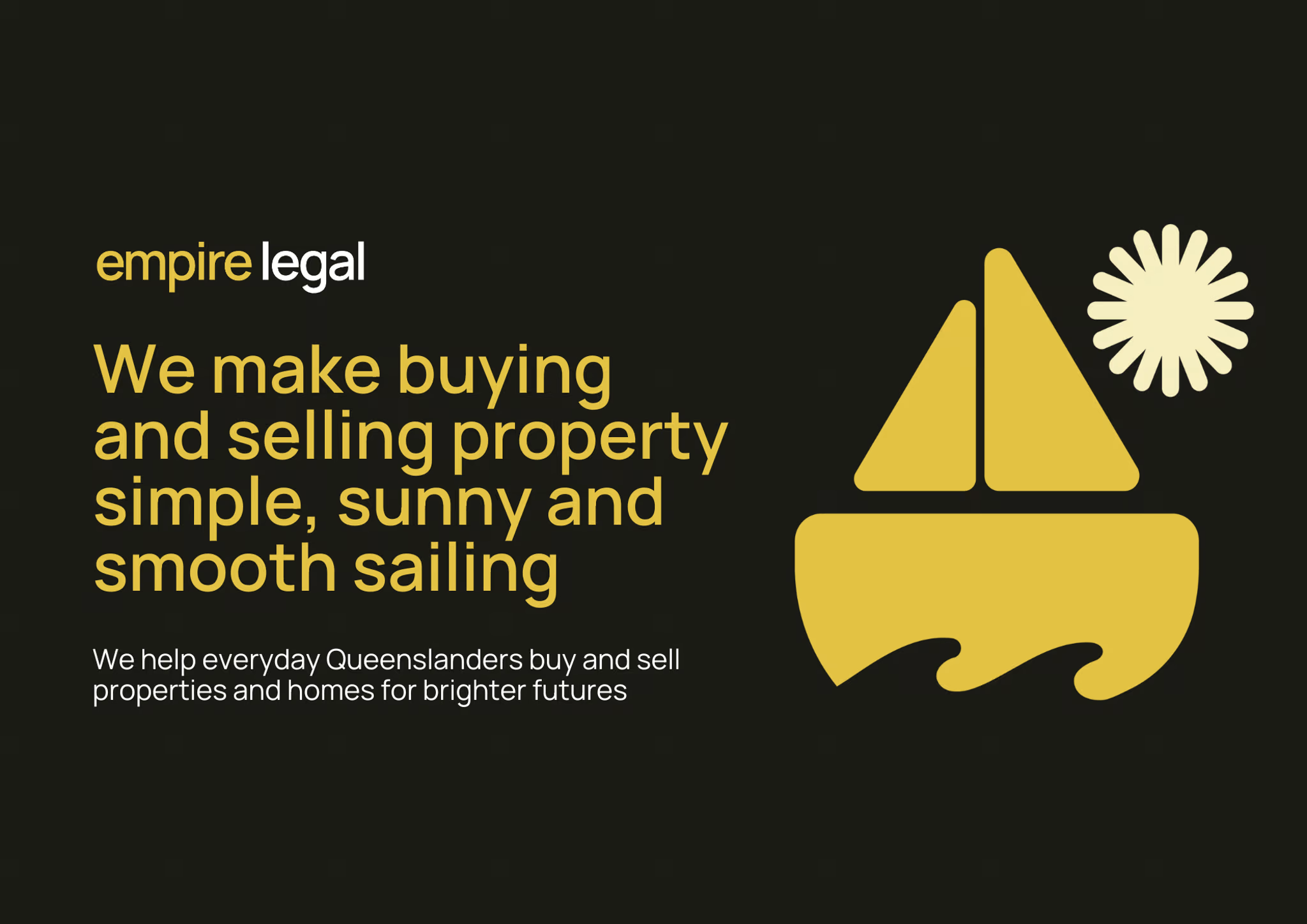
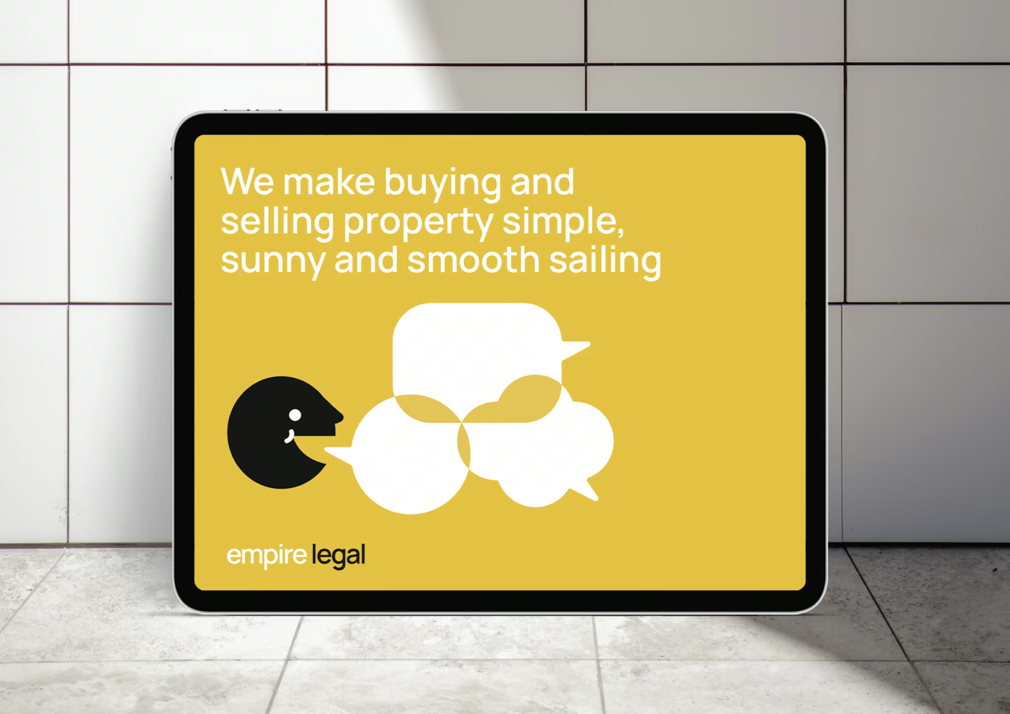
Positioned Empire Legal as the innovative property law firm that specialises in efficient, friendly, experience-driven conveyancing for everyday people and the lives they live. Not stuffy corporate lawyers. Not over-the-top fancy. Property people who genuinely care, sitting comfortably in the middle where real humans live.

Challenge: They'd already invested in signage and materials across three locations. We needed to elevate without completely abandoning existing brand equity. A refresh, not a revolution.

✿ Visual Identity:
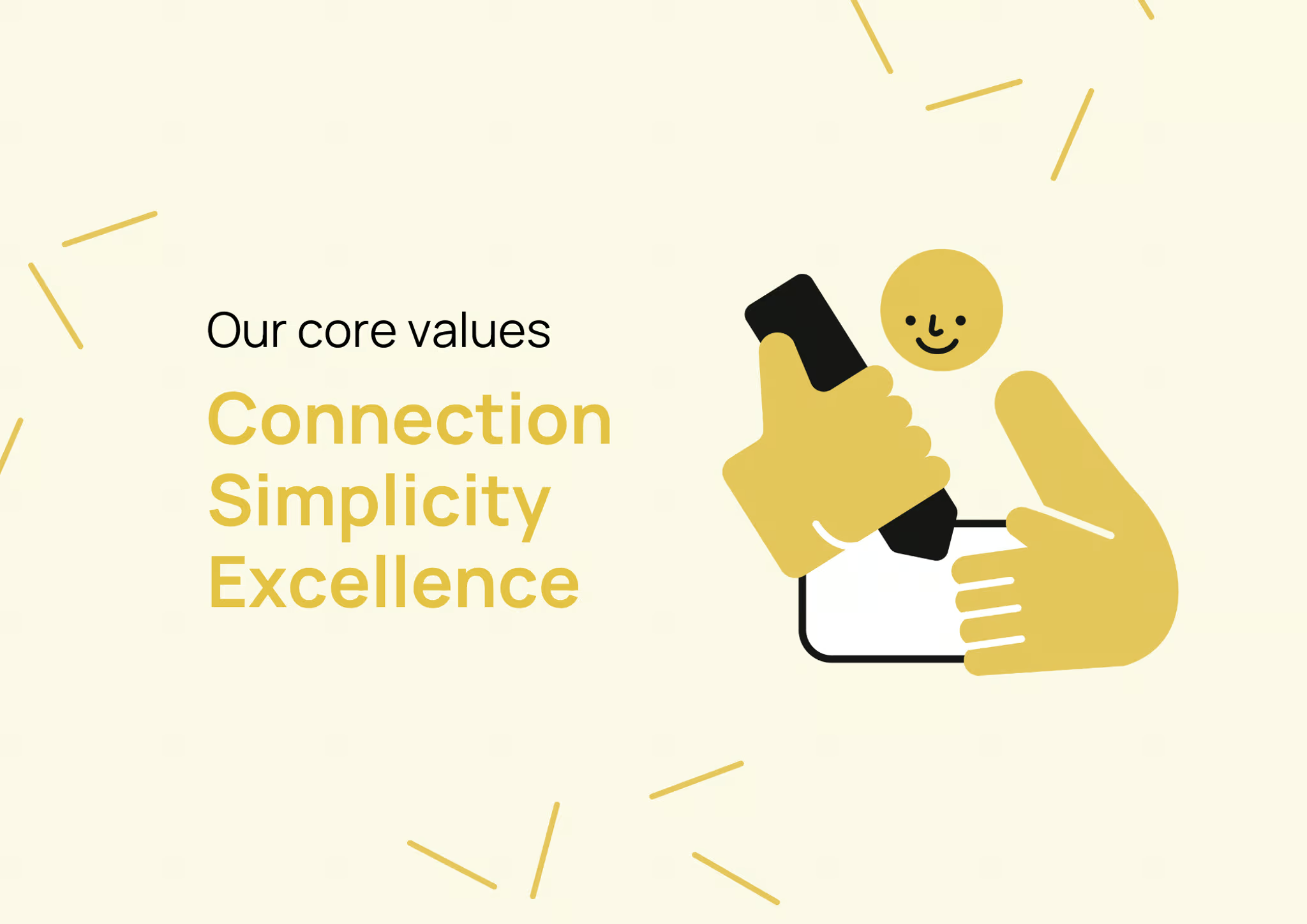
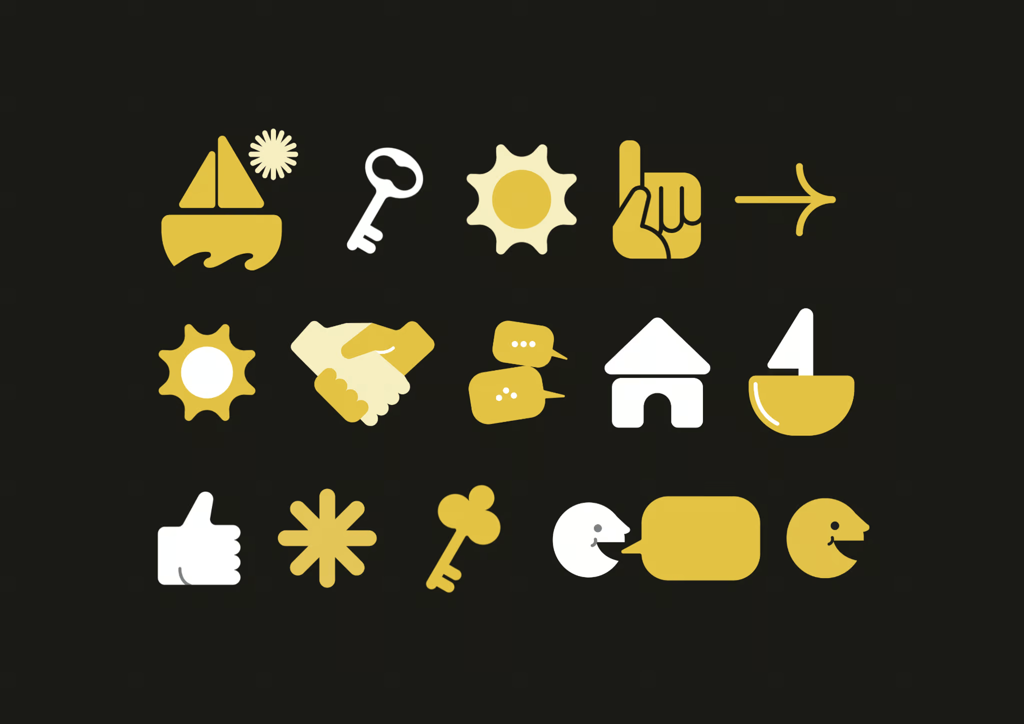
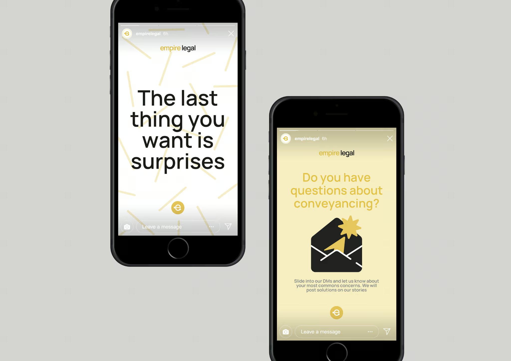
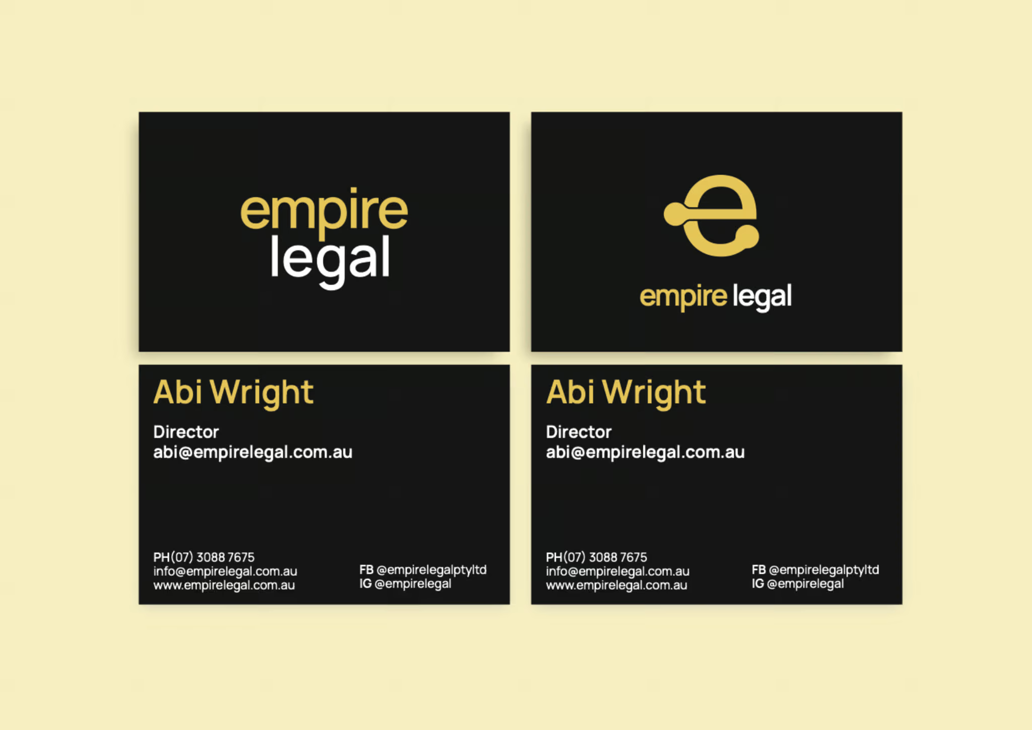
Kept their bold signature yellow/gold, black and white palette (it's unmistakably them) but elevated everything else. Refined the logo system for consistency. Created a comprehensive icon suite for use on their website and supporting graphics that bring personality without losing professionalism. Introduced sophisticated typography hierarchy. Developed social media graphics showing they're approachable property people, not boring lawyers.

The result? Professional enough for serious legal work, personable enough to show they're humans helping humans. Not cheap-looking, not intimidatingly fancy. Exactly where they wanted to sit in the market.

✿ Voice & Digital Presence:

  • Readcity Writing developed a voice that sounds like property people, not corporate lawyers. Along with copy that educates and connects. 
  • Ola Digital built a website that looks "schmick" and reflects their position as leading conveyancing firm.

The Transformation

Empire Legal went from looking like a spare bedroom startup to presenting as the established market leader they actually are.

Business Impact:

  • Professional brand presence finally matching their 1100+ five-star review reputation
  • Consistent visual identity system working across three Queensland locations
  • Personality showing through that differentiates them from stuffy competitors
  • Elevated website reflecting their market position as leading conveyancing firm
  • Brand infrastructure supporting continued growth without constant redesigns
  • Social media presence showing they're property people who care, not corporate lawyers who don't

Before → After:

  • Before: Started in Abi's spare bedroom (November 2017), grew to three offices and 20 team members, built a stellar reputation through excellent client experience, but the brand looked outdated and cheap. Mismatched visuals everywhere. Budget website. No personality showing what made them different. Their work outshone their branding by miles.
  • After: Polished, consistent brand presence matching their market leadership. Professional visual identity working seamlessly across three locations. Personality shining through showing they're approachable property people. Website and materials reflecting their position as Queensland's go-to for smooth-sailing conveyancing. Brand equity is preserved while everything is elevated for the next growth phase.

The Journey:

  • How it started: Two founders in a spare bedroom townhouse in Wynnum West, building a conveyancing practice on the radical idea of actually caring about clients and responding fast.
  • How it's going: Three offices (Spring Hill Brisbane CBD, Wynnum/Manly Bayside, Burleigh Heads Gold Coast), 20 team members, 1100+ five-star Google reviews, and brand presence that finally shows the world who they really are. Property law without the snore.

Or, in Abi’s words…

"We're so happy with how the branding turned out and really appreciate you and your team's efforts to get us there!"

What Emerged…

This case study shows us the power of brand refresh done right. Empire Legal didn't need to abandon everything they'd built. They needed elevation that honoured existing equity while showing their personality. The insight? They're not trying to be the fanciest or the cheapest. They're the property people in the middle where everyday Queenslanders live, making legal stuff simple, sunny and smooth-sailing. Their 1100+ five-star reviews proved they were exceptional. Now their brand shows it too.

https://empirelegal.com.au/